Sunday, February 21, 2010

MrB 11 Maths - class of Mon 22nd Feb

Hey everyone,


This is the last section of our study of Statistics, on "Comparing sets of data". Stemplots and Boxplots are particular useful for doing this.


This lesson you need to make sure you understand:
  • Back-to-back stem-and-leaf plots:

    • these are used to compare the distribution of two similar sets of data, by giving a visual representation of the sets of data.
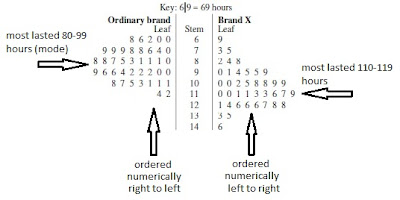
    • the two sets of data share the one central stem. The set on the left are ordered numerically from right to left.
    • use mode(s) and spread to compare the data sets.

      For example, the following back-to-back stemplot shows how long 40 batteries of Brand X lasted, and how long 40 batteries of another "ordinary" brand lasted. We can say that:
      • Brand X batteries can be expected to last longer than ordinary batteries, by up to 20-30 hours.
      • However Brand X lifetime a slightly more variability in battery lifetime (146-69= 77-hours, whereas Ordinary brand range from 114-60= 54-hours).
  • Parallel Box-plots:

    • these are also very good for comparing two sets of data, visually.
    • two boxplots (one for each set of data) are drawn using the same scale. Remember, a boxplot graphs the 5-number-summary (min,Q1,median,Q3,max). Here is a picture of parallel boxplots for our batteries data:
    • this visual representation is better in some ways, as you can now compare:
      • medians (central tendancy),
      • IQRs (spread) and
      • ranges (spread)
As an exercise, using the back-to-back stemplot above, find the 5-number-summary for Brand X, and then for Ordinary brand to confirm the above boxplots are correct. Can you do it - if not ask MrB.
    • Looking at the above parallel boxplots we again see that:
      • Brand X are expected to last longer (by 20 hours - from medians)
      • Brand X shows more variablility (its range is 77 hours and IQR is about 27. Ordinary brand range is 54 and IQR is about 19)
      • Since 25% of data lies between Q3 and max, we can say that more the one quarter of Brand X batteries last longer than the longest lasting Ordinary brand. Ask MrB if you can't see this from the graph.
  • Parallel Box-plot on your CAS ClassPad:

Read through WE 19oon textbook page 52-53 and do it on your own ClassPad (or your laptop) to show you how to display parallel boxplots on your calculator.

You are now ready to:
  • work on the 1H exercises
  • read through the Chapter Summary and
  • do the Chapter Review questions

ENJOY!!!!!!! MrB


    Saturday, February 13, 2010

    MrB 11 Maths - class of Mon 15th Feb

    Hey everyone,

    This is the stuff you need to make sure you understand this lesson:
    • Stem-and-leaf plots (stemplots):
      • A stemplot is another useful way of summarising a small to medium sized set of data.
      • Each number in a set of data is broken into two parts; the right-most digit becomes a leaf, and all the other digits become a stem.
      • Check out WE 14oon textbook page 40 to see how this is done

      • When creating a stemplot make sure you:
        • end up with 5 to 10 stems - split stems into a smaller class interval if needed (see half way down page 41 for an explanation)
        • evenly space the leafs
        • put leafs in numerical order
        • use a key

      • Since the stemplot is in numerical order the Q1, median, Q3 and IQR can be easily found - check out WE 16oon textbook page 42.
      • Stemplots look like a Histogram on it's side.

    NOW do your 1F exercises.
      • Box plots:
        • A boxplot is a 'picture' of the minimum, Q1, median, Q3 and maximum values of a set of data (see example above - minimum=30, Q1=52, median=76, Q3=102, maximum=125).
        • The minimum, Q1, median, Q3 and maximum are called the five-number summary of a set of data. The five-number-summary is always is this order (min,Q1,med,Q3,max).
        • A boxplot is always drawn with an evenly spaced scale, counting by 2 or 5 or 10 or 100 or  whatever is best.
        • Outliers (extreme values) are values in the data that don't 'seem' to fit, or are exceptional (see "Identification of extreme values" on page 47
        • To describe the distribution (of the data values), you must write something about the shape, the centre, and the spread of the boxplot or histogram.
      Read textbook page 46 - "Interpreting a boxplot" and note that 25% of the set of data lies between:
          • minimum to Q1            and
          • Q1 to median               and
          • median to Q3               and
          • Q3 to maximum

          • Also note how a boxplot and histogram are matched.
      Now, follow the link - http://nlvm.usu.edu/en/nav/frames_asid_200_g_4_t_5.html?open=instructions&from=grade_g_4.html - to see how a a histogram for the same data as the boxplot would look. Enter the data in  WE 18 into the web page and switch between Histogram and Boxplot. Try another set of data or your own made up set.

      Now do your 1G exercises.